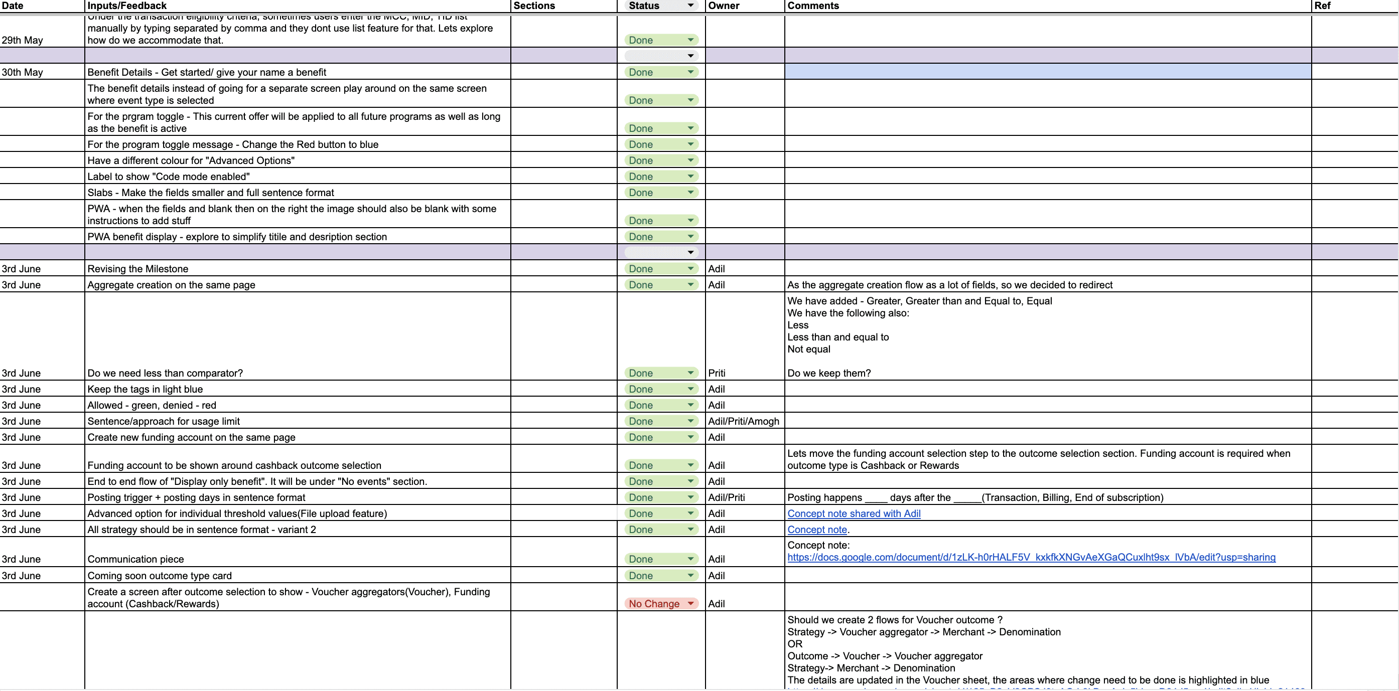
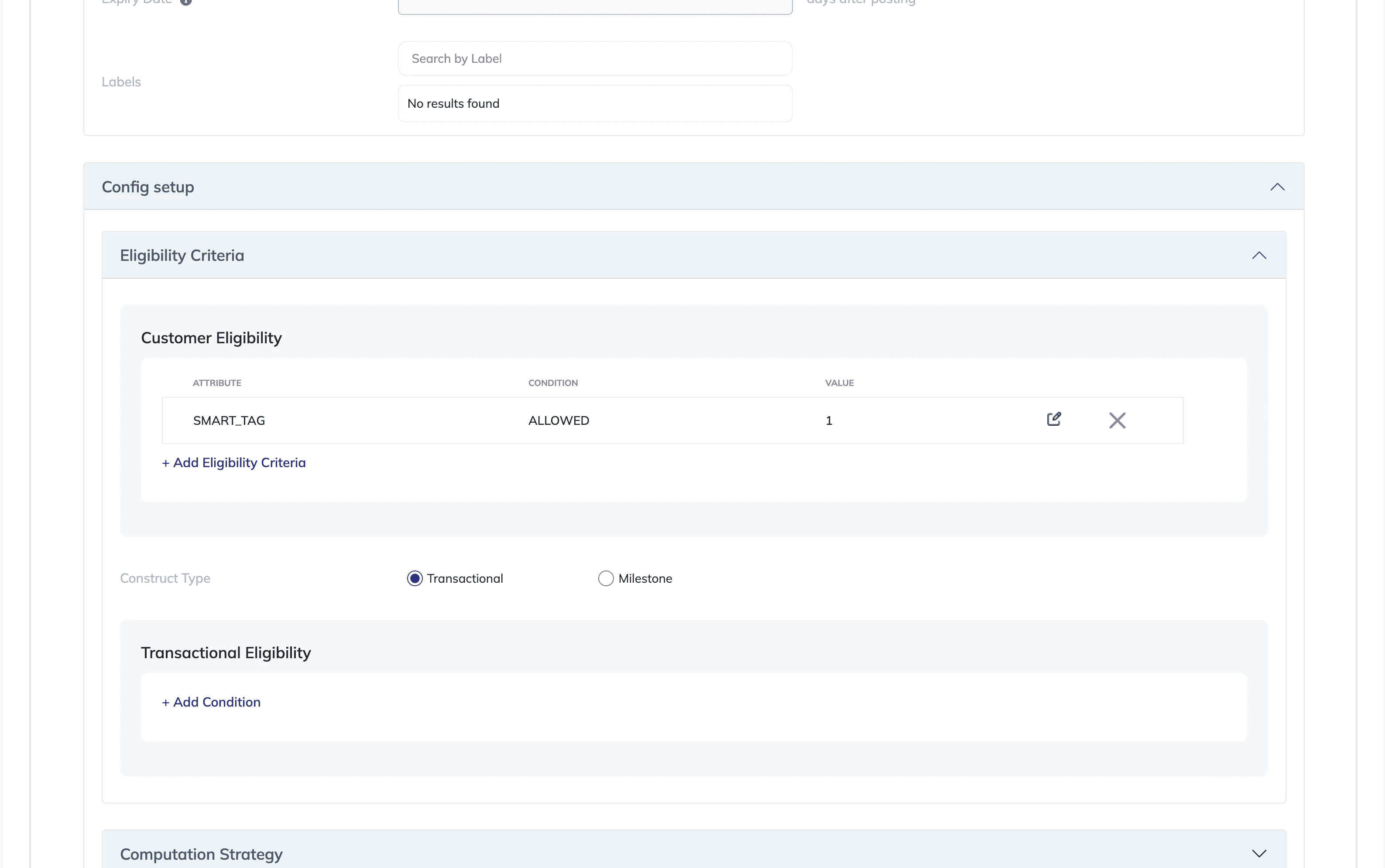
Complex Navigation: Users found it challenging to navigate through nested features and identify key actions quickly. It became a chore to fill out all the details in the form.
Outdated & Noisy UI: The dashboard's design was visually outdated and didn’t reflect a modern product experience.
Complex User Flows: Since the creation involved multiple steps, it became to challenging to demonstrate quickly or concisely.
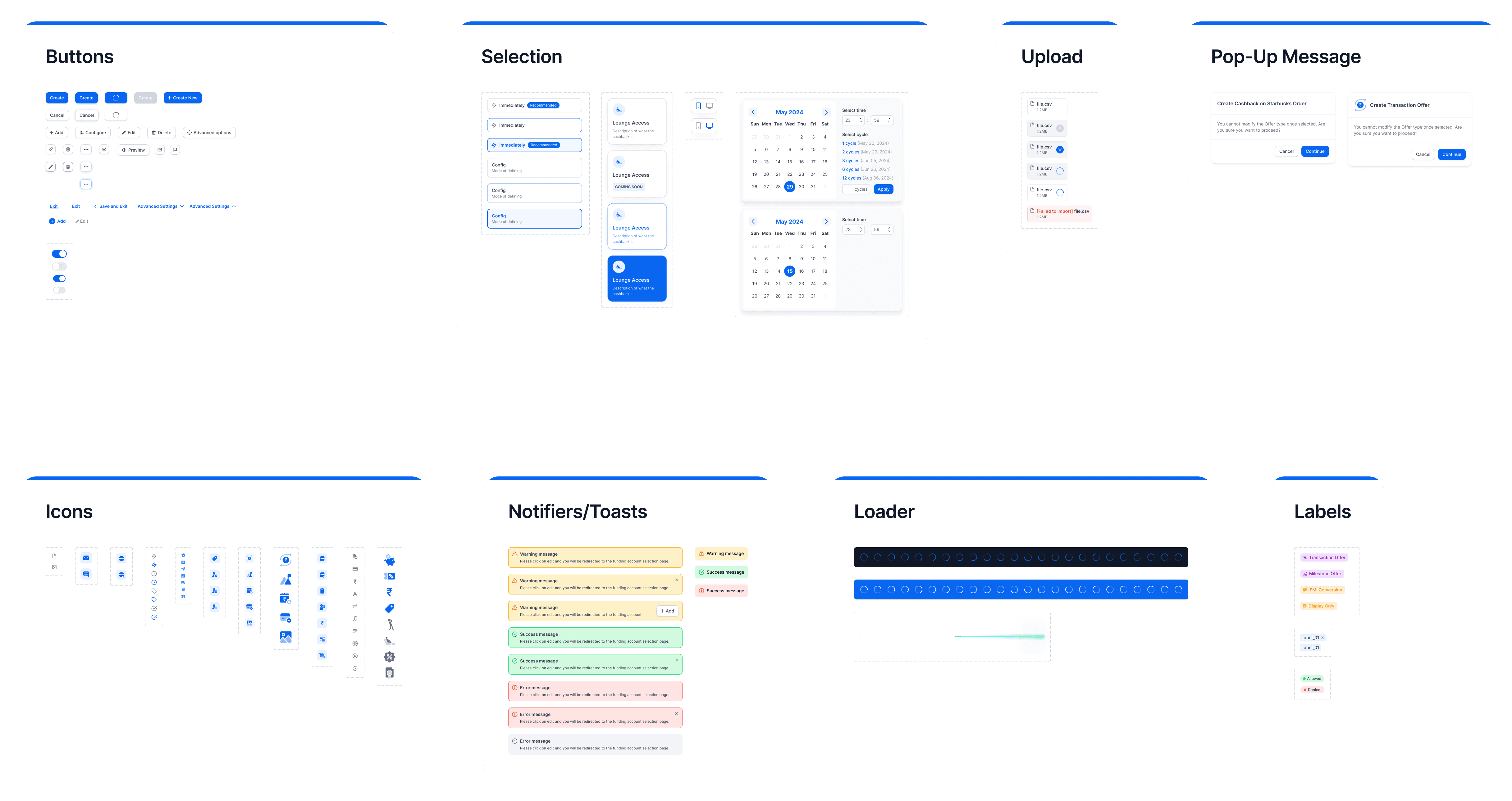
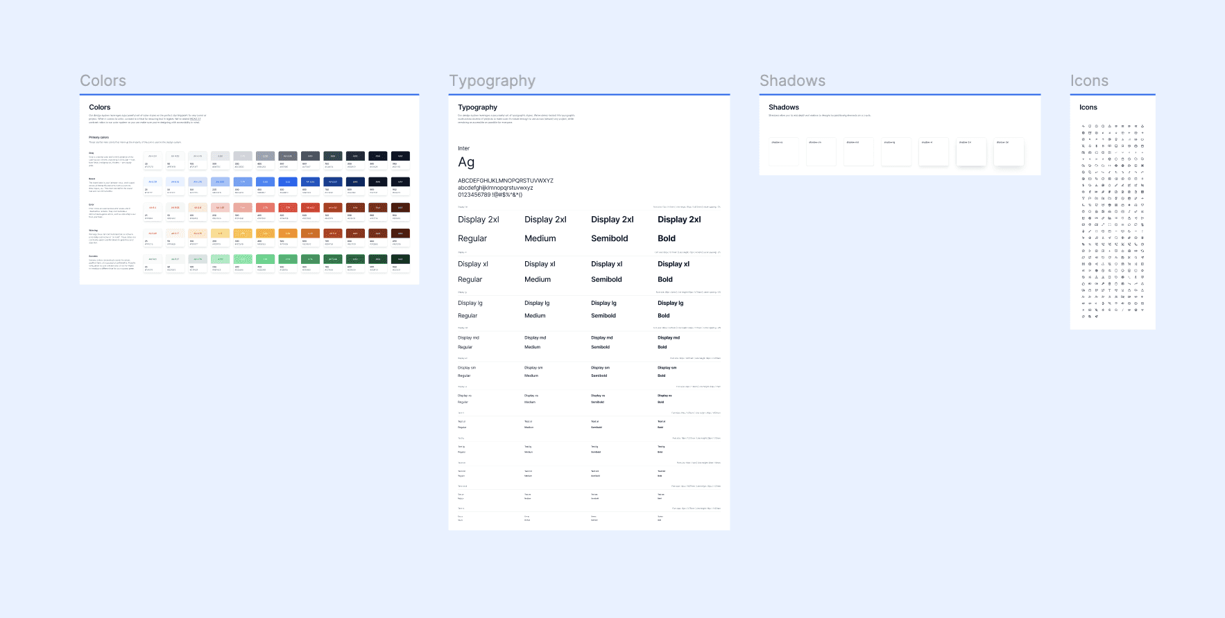
Goal 1: Create a visually cohesive and modern design system aligned with Hyperface’s branding for the dashboard which can later on be used to redesign the entire platform.
Goal 2: Simplify the steps involved by regrouping form fields and adding visual cues to make each step self explanatory and accessible.
Goal 3: The form should be understandable by non-tech stakeholders after one demo or video walkthrough. Additionally, it should be seamlessly demoable with minimum effort.
Step 1: Research & Ideation
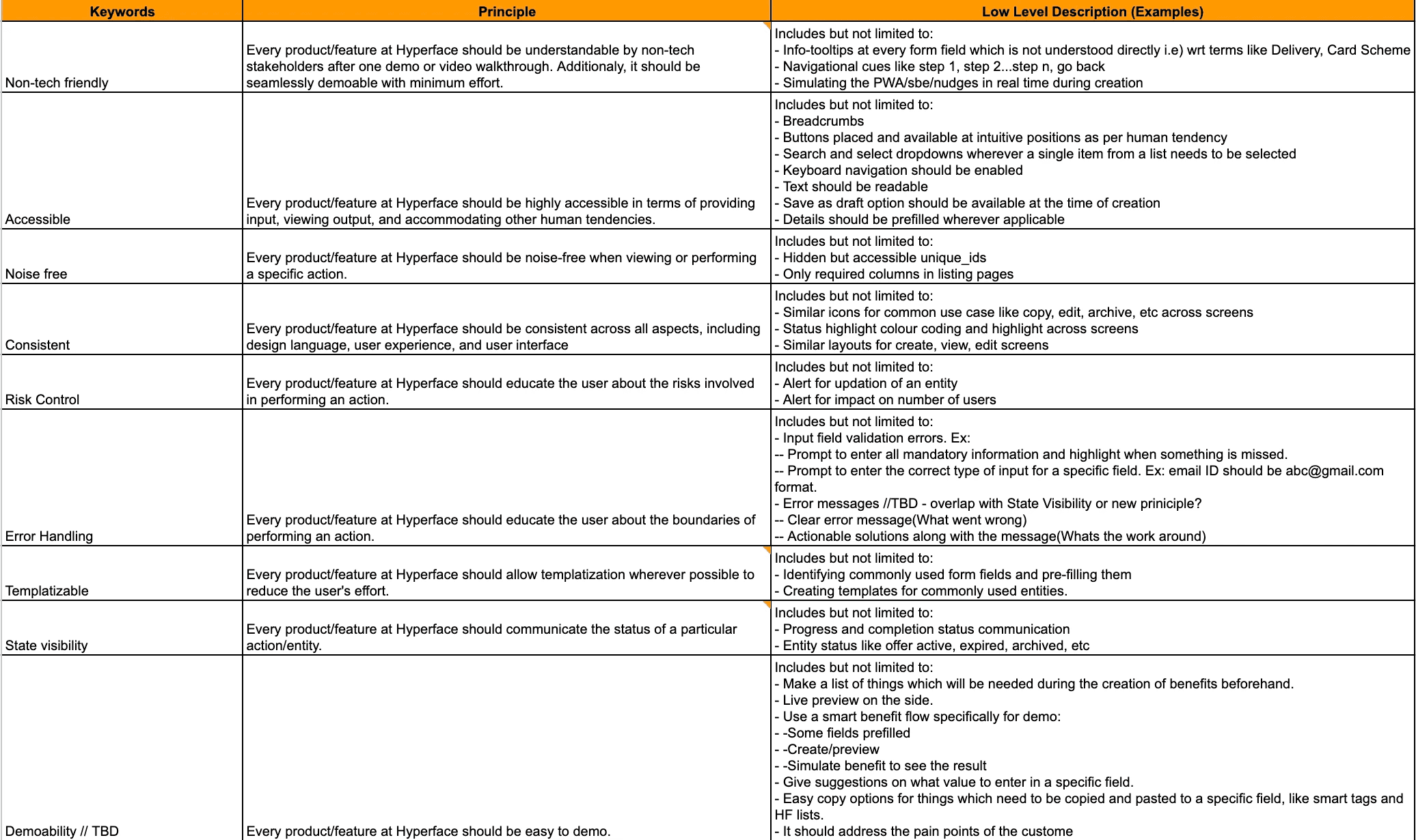
Conducted a heuristic evaluation based on product knowledge and team input. A set of product principles were tailored for the entire platform.
Step 2: Information Architecture & Wireframing
Developed wireframes to map out the restructured dashboard layout, focusing on hierarchy and usability with the help of Product Managers.
Step 3: Visual Design & Prototyping
Updated the colour scheme, typography, and components to create a clean, modern look.
Designed interactive prototypes to test new user flows and gather initial feedback from team members.
Step 4: Final Design & Iteration
Refined prototypes based on feedback and finalized the design for development.
Worked closely with developers to ensure a smooth handoff and accurate design implementation.
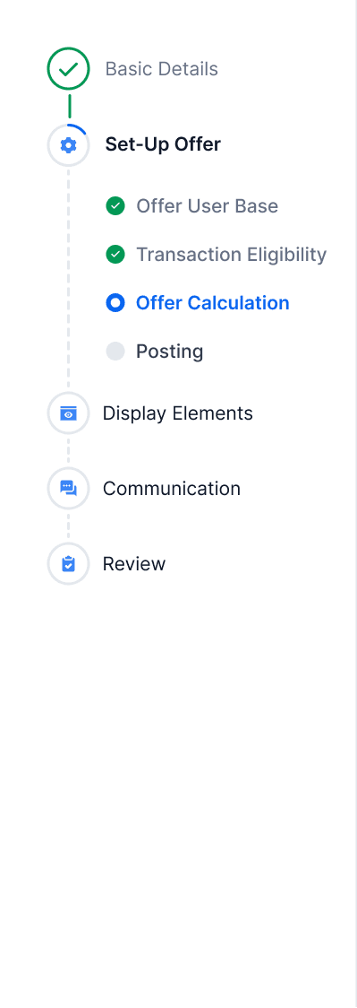
Streamlined The Process By Adding Stepper
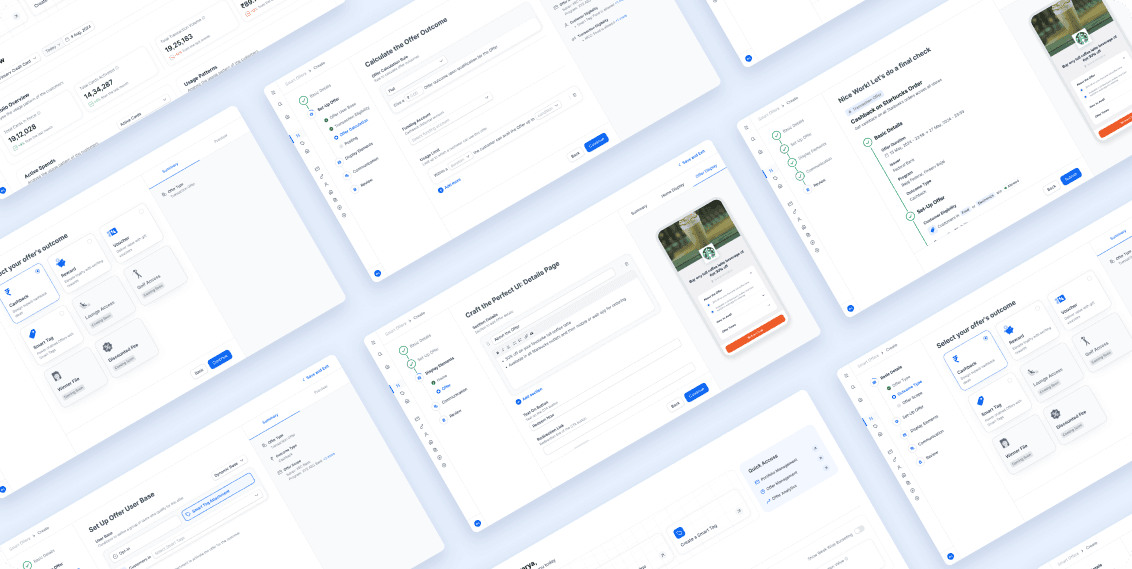
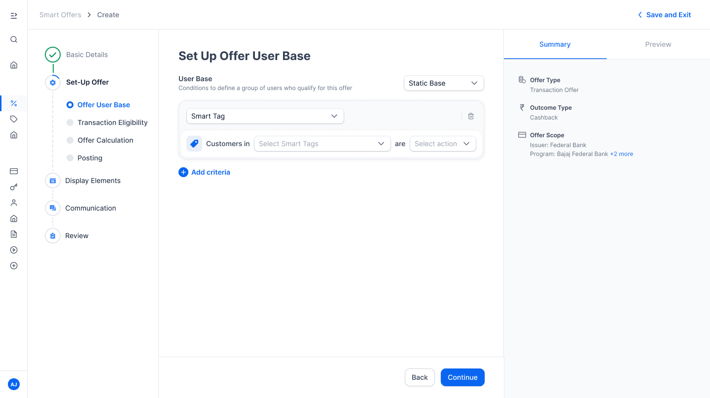
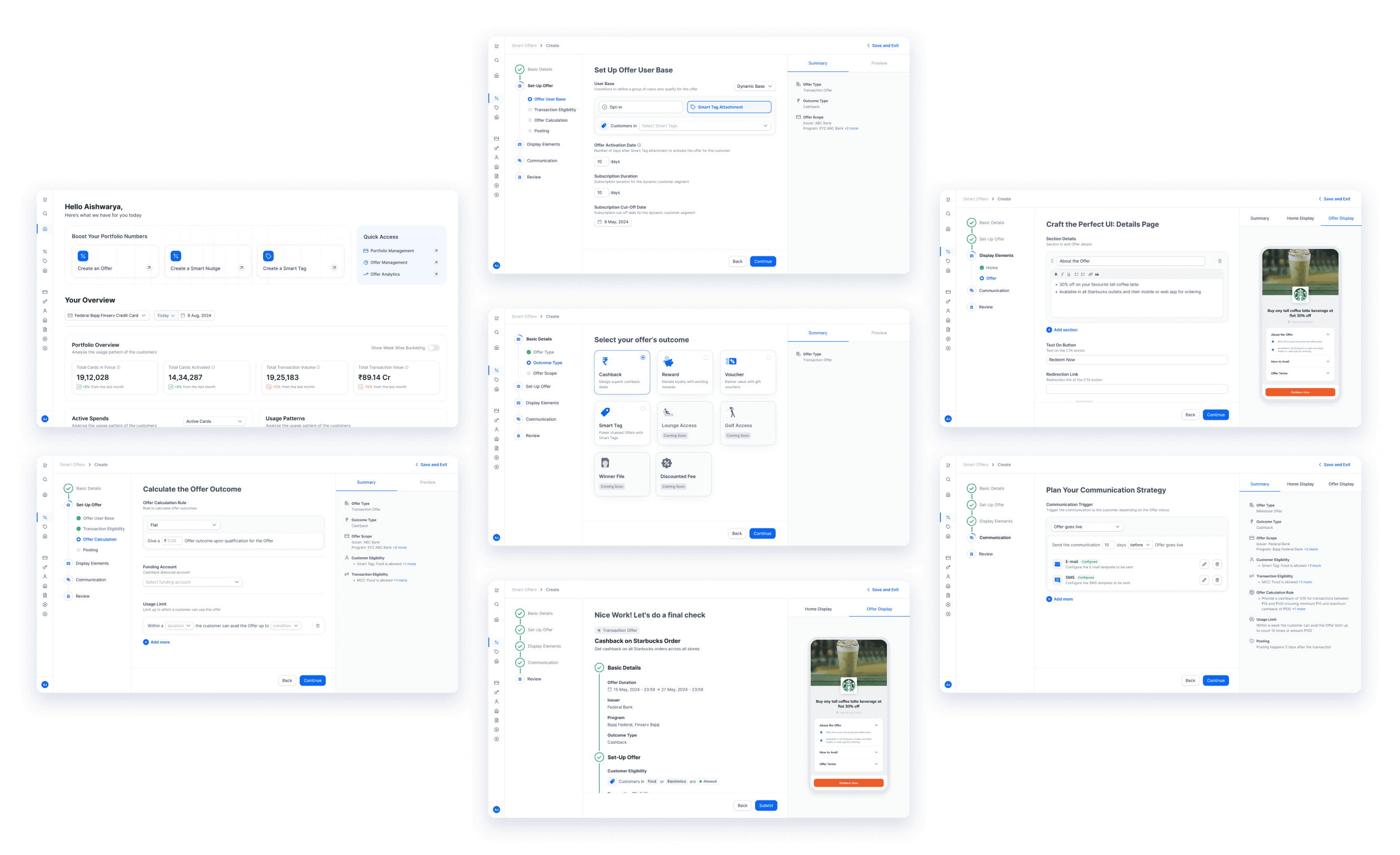
A stepper component with sub-steps were added indicating the progress and status of the form during each step.
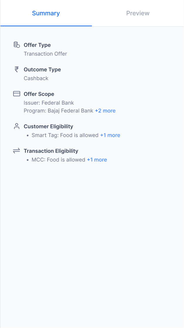
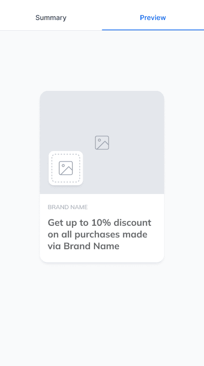
Inclusion of Summary and Preview On Right Side
A summary and preview tab were added to the right side of the form which highlighted the input provided in the previous steps making it easier for the user to fill in the subsequent steps
The preview tab was enabled in steps where users could see the final form of the offer being created to better understand the look and feel of the offer. It also helps in demonstrating the platform and process to clients.
Custom Components For Computation & Strategy
Some of the components were meticulously crafted to meet the needs of the form field used for computing the offer, defining user segments, strategising communications, etc.
The number of clicks for some of these fields were halved when compared to the old dashboard.
Review and Submit
A review section was added to help the user have a holistic view of the offer created before submitting for approval.
Enhanced Usability
Intuitive navigation reduced time to create an offer.
Easy to configure input fields with all functionalities.
Improved User Satisfaction
Initial feedback indicates that users find the dashboard easier to navigate and visually appealing.
This project was such a valuable learning experience, especially in understanding just how impactful user-centric design can be. It wasn’t just about making things look good—it was about genuinely improving the experience for the people using it. I learned that when you focus on real user needs and make even small adjustments that solve real problems, it can completely transform how people interact with a product.
Iterative testing also proved its worth. Each round of testing helped me catch usability issues early and adapt the design to be more intuitive. Even small tweaks, like adjusting button placements or improving spacing, made a surprising difference in the user experience.
Finally, I saw firsthand how a consistent visual design shapes how users feel about the product. A cohesive look with clear structure and harmony across elements doesn’t just look good—it builds trust and makes the interface easier to use.
